


Get started
Chat appearance
Everything visitors see — layout, position, logo, colors, welcome copy, and suggested prompts — lives in one page with a live preview.
Where to find it
Open the agent and go to Chat appearance under Agent settings in the sidebar (the page itself is titled Widget appearance). Settings sit on the left; the widget on the right re-renders as you type, so you can check contrast and copy before saving. Saved changes reach embedded widgets within a minute — the widget fetches its config live, not at build time.
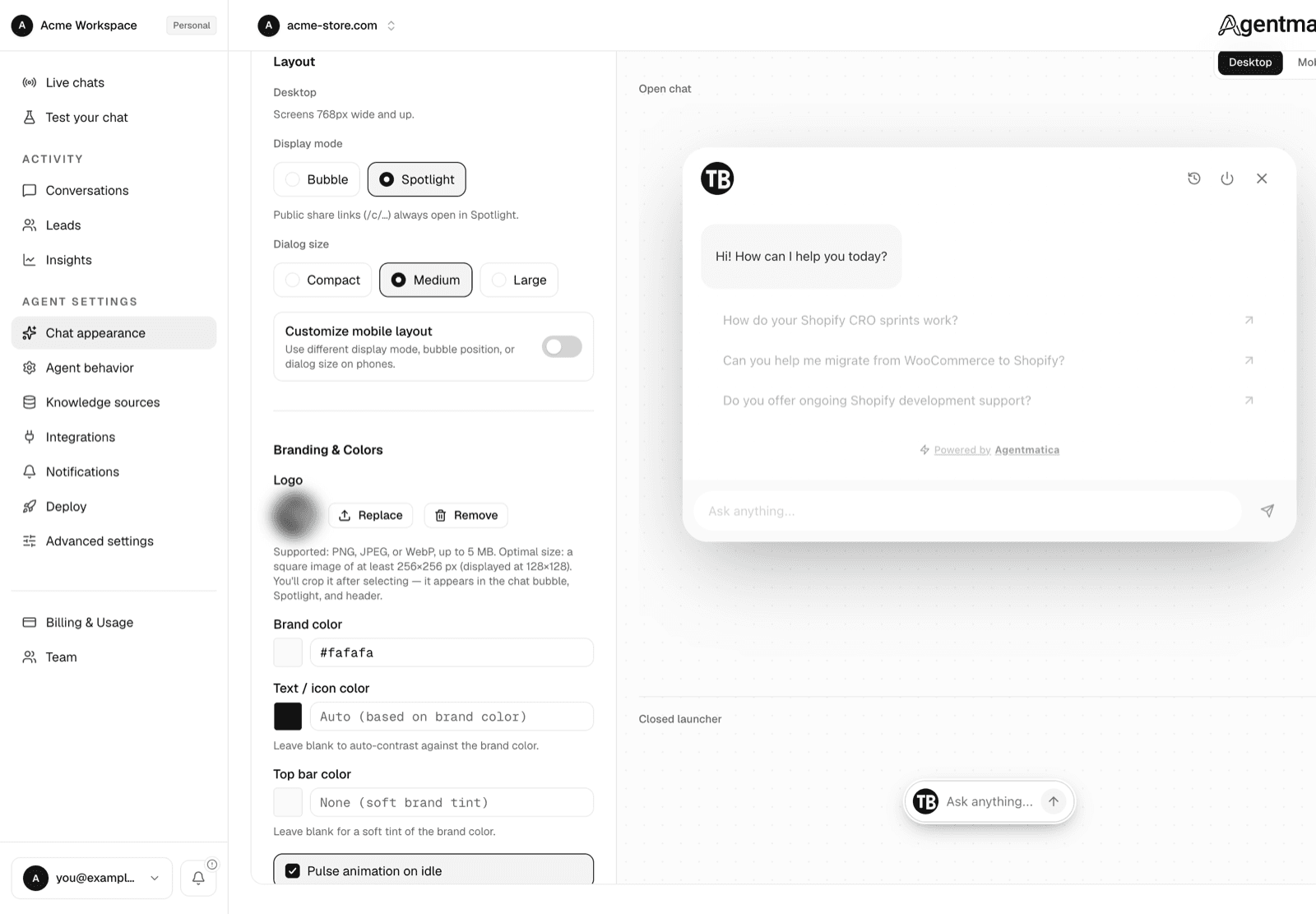
Layout
- Display mode — Bubble shows a floating launcher that opens a chat panel. Spotlight opens a centered, search-style prompt. Spotlight is the default for new agents. Public share links (
/c/…) always open in Spotlight regardless of this setting. - Bubble position — left, center, or right (default right). Only shown in Bubble mode.
- Offsets — distance from the side and bottom edges in pixels, 0–200 (default 20). The side offset is hidden when the bubble is centered. Use these to clear cookie banners, sticky carts, or a competing launcher.
- Dialog size — Compact, Medium, or Large. Leave it unset and the widget picks a size that suits the display mode.
- Customize mobile layout — off by default, phones inherit the desktop layout. Switch it on to set a separate display mode, bubble position, offsets, and dialog size for screens under 768px, for example Spotlight on desktop but a right-hand bubble on mobile that clears a sticky add-to-cart bar.
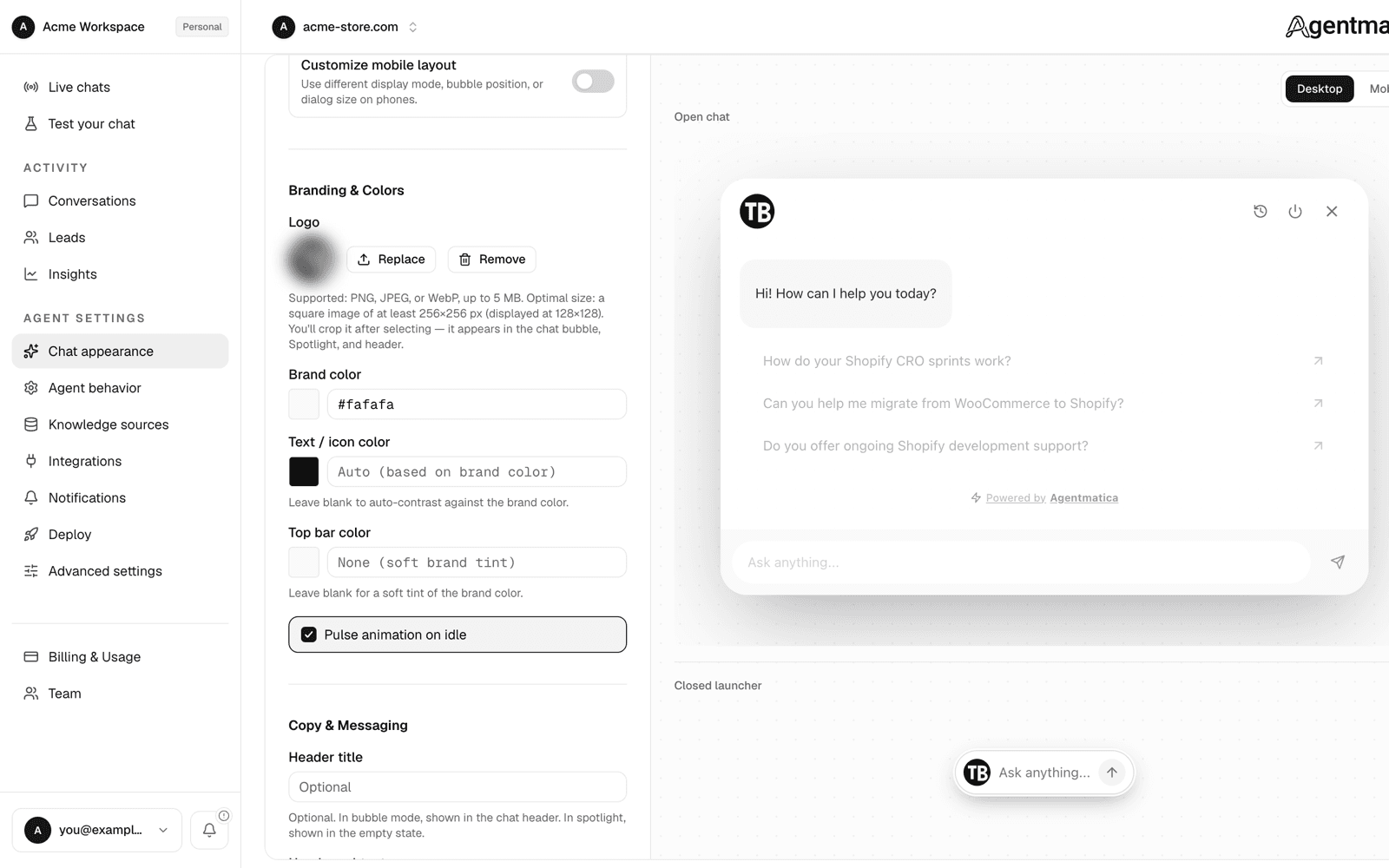
Branding & colors
- Logo — PNG, JPEG, or WebP up to 5 MB. Upload a square image of at least 256×256 px; it is displayed at 128×128 in the bubble, Spotlight, and header. After you pick a file you get a crop step, so a wide logo can be trimmed to a square without leaving the dashboard. Each upload gets a new URL, so visitors never see a cached old logo.
- Brand color — the primary surface color for the bubble, header, and send button.
- Text / icon color — optional override for text on brand surfaces. Leave it empty and we pick black or white automatically for contrast.
- Top bar color — optional distinct header color. Empty means a soft tint of the brand color.
- Attention pulse — a subtle idle animation on the bubble. On by default.
- Tell visitors when a team member is replying — a banner shown while a human has taken over the chat. On by default. See Escalation & leads.
Copy & messaging
- Welcome message — the first assistant bubble (up to 500 characters).
- Header title and Header subtext — the heading and one-liner in the chat header above the composer (up to 120 characters each).
- Spotlight placeholder — the empty-state text inside the Spotlight input (up to 120 characters).
- Privacy policy URL — linked from the widget footer. Must be an http(s) URL.
Suggested prompts
One list of starter questions (up to 8, 120 characters each). They appear under the welcome message and in Spotlight. Trimmed at a word boundary if they run long.
Prompts are also how you steer new visitors toward the questions your agent answers best — put your top three support or sales questions here rather than generic “Ask me anything” copy.
Showing and hiding the widget
The master on/off switch and the list of pages where the widget stays hidden live on the Deploy page, next to the embed snippet — see Deploy the widget.